Additional oxide testing results
- Victoria
- Feb 11
- 4 min read

This piece is made from woven porcelain paperclay, a material that allows for both strength and extraordinary fineness. The woven structure gives it a lightness and fragility that feels almost textile-like, while still retaining the quiet resilience of porcelain.
Before glazing, I applied a blend of iron oxides — red, yellow and black — allowing the different tones to settle into the surface and catch within the subtle variations of the weave. A coat of transparent glaze followed, and the piece was then placed into a reduction firing.
The result is unbelievably delicate. The colours that have developed through the firing are soft yet complex, with warm, earthy transitions that shift beautifully across the surface. There is a depth and richness that feels almost luminous.
It is more beautiful in real life than this photograph can convey — the subtle tonal changes and gentle movement of colour are something the camera struggles to fully capture.
Pieces like this remind me why I’m so drawn to reduction firing: the way the atmosphere in the kiln collaborates in creating surfaces that feel alive.

This stoneware vase is one of the very first pieces I made — the one that required a little “surgery” to straighten it. It feels fitting that it has continued its life as an experimental piece, carrying the marks of learning, adjustment and exploration.
From the beginning, I used it to explore mark making, testing how different tools and gestures would sit on the surface. When it came to glazing, it naturally stepped into that experimental role once again.
Working from top to bottom, I applied alternating copper carbonate and cobalt carbonate to each distinct area of mark making, allowing the different oxides to respond individually to the texture beneath them. Over the entire piece, I brushed a layer of white underglaze, followed by a transparent glaze, before placing it into an oxidation firing.
I’m very pleased with the results. The interaction between the copper and cobalt across the varied textures is incredibly exciting — each mark holding and breaking the colour in its own way. The white underglaze has softened and unified the surface beautifully, creating a mellow, almost atmospheric quality that balances the strength of the oxides.
This piece may have started as a learning curve — and needed a little corrective surgery along the way — but it has become an important stepping stone. I’ll definitely be carrying these techniques forward into future work.

This sunflower bowl, made from black porcelain, was never meant to be part of this glazing batch. After several of its delicate sections snapped off during the bisque firing, it became something of a last-minute test piece — an experiment rather than a carefully planned finish.
I applied copper carbonate, covered it with a transparent glaze, and decided to place it into a reduction firing. Sometimes the most unexpected decisions bring the greatest rewards.
I’m absolutely delighted with the glaze results. The surface has developed beautiful tonal variation, but it’s underneath the bowl where the magic truly happened. The rich red produced by the reduction-fired copper is just stunning — deep, glowing, and full of life against the dark clay body.
It’s one of those happy accidents that shifts direction. My aim now would be to recreate this effect across an entire piece — to capture that depth of red and allow it to flow more intentionally over the surface.

This decorative bowl is made from black porcelain — a beautifully rich but incredibly delicate material to work with.
The surface was coated in copper carbonate, then covered with a transparent glaze before being placed into an oxidation firing. The firing has intensified and enhanced the depth of the black clay body, giving the bowl a quiet strength and presence.
I had hoped for a few more hints of colour to emerge from the oxide, perhaps subtle flashes or tonal variation breaking across the surface. While the effect is more restrained than I anticipated, the result has a sophisticated, almost understated quality.
Next time, I think I’ll be a little more generous with the copper carbonate to encourage those richer colour responses.

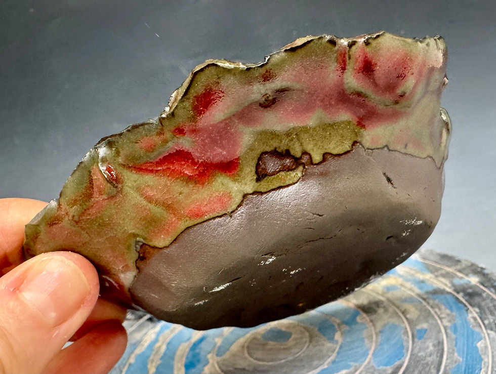
This vessel is made from porcelain paperclay, chosen for its strength and delicacy, and for the way it responds so beautifully to surface treatments. The exterior was coated in a thick layer of copper carbonate, which I then carefully sponged back in areas, allowing subtle variations and movement to emerge across the surface.
The entire vessel was dipped in a transparent glaze before being reduction fired. I’m absolutely delighted with the results. While I had originally intended for the central column to remain a pure, crisp white, the firing had other ideas. Instead, a beautiful pink-red has blossomed across the surface.
The outer layer has developed into a rich and atmospheric mix of blacks, reds, pinks and bronzed tones, shifting gently in the light. The deliberately ragged edge at the top of the central column — which was extruded — has caught the pink highlights in the most wonderful way, enhancing the sense of movement and softness against the darker exterior.


Comments